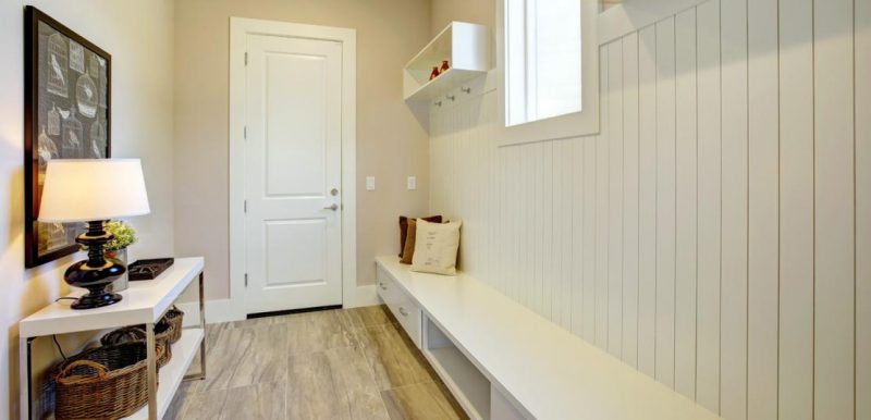
An entryway gives home buyers their first impression of the inside of a home. A foyer that is dark or cramped can be a turnoff.
Realtor.com® recently asked designers for common mistakes they see in the appearance of the entryway. Make sure you’re not making these four mistakes.
1. Furniture that's not up to scale. Choose slender items that are meant to fit a smaller space. You don’t want to block a path to the inside of your house. The scale of the furniture is critical for the entryway. “The entryway has a function, and it’s best to keep this in mind when choosing furniture,” Laurie Wiluan, founder and CEO of Personal Space MB, told realtor.com®.
2. Dark entries. “We want our entryways to make a person walking in feel happy and at peace,” says designer Kayla Goldstein of Kayla LLC. “A dark entryway will make them want to leave, even subconsciously.” Designers recommend having a large source of light on the ceiling, as well as bright walls and decor.
3. Disorganized. Have a place to take off shoes as you enter and even place your groceries or bags as you enter. “No matter how small or big your entryway, you need a place to dump your keys, organize clutter, etc.,” Goldstein told realtor.com®. “This can be a little shelf, a table with a tray, or hooks that have some kind of hanging organizer. The only thing I would be careful of is to make sure you don’t leave too much space for clutter because then it will become overcluttered—not something we want to walk into every day.”
4. No seat. If space allows, add a seat. When you enter a home, you often want to take off your shoes, and this makes it easier to do so. “If there’s not enough room for two chairs or a bench, a stool can work, and it doesn’t have to look utilitarian,” says Wiluan. “There are beautifully painted ceramic stools that can brighten a foyer and function as seating when needed.”
Source: “6 Classic Foyer Décor Mistakes That Make Designers Cringe,” realtor.com® (March 17, 2020)


